Plotting
In engineering, we visualize the relationship between variables to understand their behavior and to communicate results with our peers. MATLAB includes several useful tools for creating plots such as line graphs, contour plots, and 3D surfaces. Knowing how to present your findings is just as valuable as generating them, and plots are one way to present your data.
Visit Create 2-D Line Plot for the MATLAB Help Center’s documentation on creating line plots.
Basic Plotting
The built-in function plot creates line plots and takes two inputs: an array of x values and an array of y values.
These arrays must be the same length, so there is one y value for each x value.
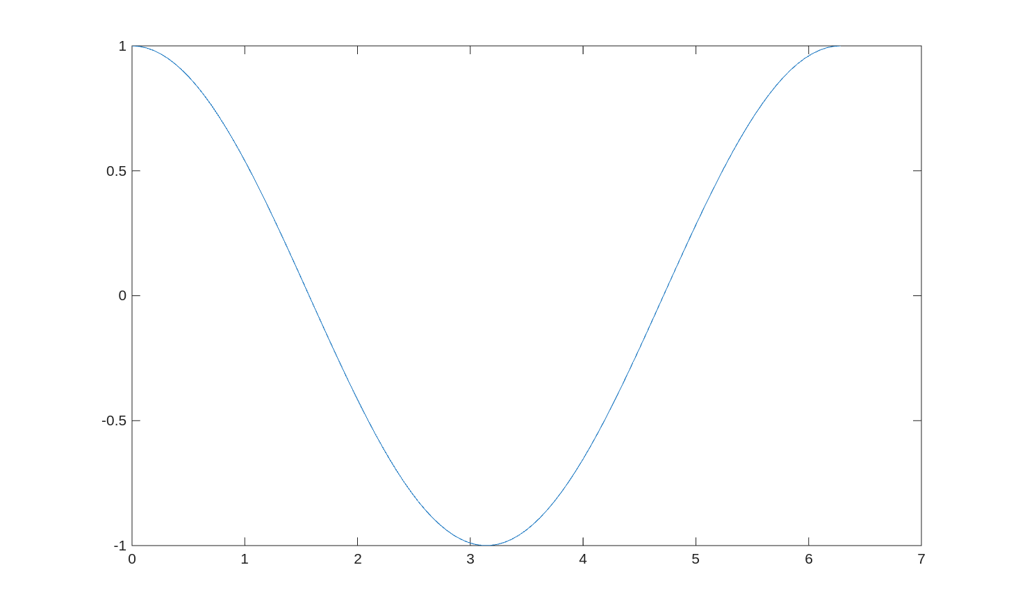
For example:
x = linspace(0, 2*pi);
y = cos(x);
plot(x, y)
Creates a new window containing this plot:
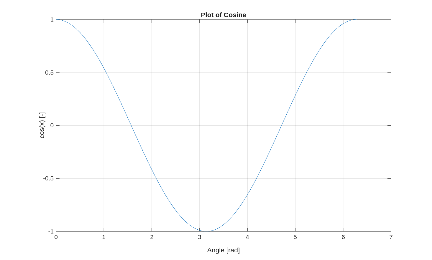
While the above plot shows y vs x in a plot, it is missing axis labels.
To add labels to the axes, use the xlabel and ylabel commands.
The title command will add a title to the top of the plot.
Lastly, you can add gridlines to the plot using grid('on').
For example:
x = linspace(0, 2*pi);
y = cos(x);
plot(x, y)

xlabel('Angle [rad]')
ylabel('cos(x) [-]')
title('Plot of Cosine')

grid('on')
The MATLAB Help Center has documentation of the plot command.
Plotting Multiple Lines
If you want to plot multiple lines on the same plot, you need to use the hold command.
For example:
x = linspace(0, 2*pi);
y1 = cos(x);
y2 = sin(x);

plot(x, y1)
hold on   % "hold" the first plot - not overwrite
plot(x, y2)
hold off

legend('First Line', 'Second Line')
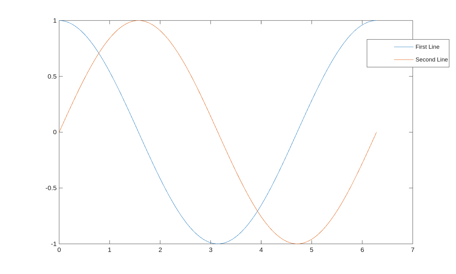
If you do not use hold on, MATLAB will plot the first line, erase it, and then plot the second line.
The hold on command tells MATLAB not to erase the existing plots.
The hold page in the MATLAB Help Center provides more documentation.
Also included in the example above is the legend command.
This adds a legend to the plot and provides context for the lines on the plot.
MATLAB attempts to find the best location for the legend, but sometimes it covers up an important feature.
To specify a corner, call the function like legend(label1, label2, ..., 'Location', 'northwest').
The legend page in the MATLAB Help Center provides more documentation.
Customization
MATLAB contains default colors for plots, but you can customize the appearance of each line on the plot. The six primary options you can change for a plotted line are:
- Line color
- Line type
- Line width
- Marker color
- Marker type
- Marker size
The line color options are:
| Symbol | Color Name |
|---|---|
'r' |
Red |
'g' |
Green |
'b' |
Blue |
'k' |
Black |
'm' |
Magenta |
'c' |
Cyan |
'y' |
Yellow |
You can also use RGB triplets or hexidecimal codes to specify colors.
The line type options are:
| Symbol | Description |
|---|---|
'-' |
Solid line |
'--' |
Dashed line |
':' |
Dotted line |
'-.' |
Dash-dot line |
'none' |
No line |
The line width is specified with a number, like plot(x, y, 'LineWidth', 5).
Putting all these together, to create a green dashed line of width 10, we would write plot(x, y, 'g--', 'LineWidth', 10).
We can also specify color and line type separately like this: plot(x, y, 'Color', 'green', 'LineStyle', '--', 'LineWidth', 10).
Just like x and y, the color, linestyle, and line width can also be variables.
For example, if you have a script that generates many plots you can save the plot colors to variables.
You can also make the line width dependent on variables - so a plot of tire tracks would have thicker lines for car tires and thinner lines for bicycle tracks.
The color, type, and size of the markers are set in a similar way to the line properties.
For the marker color, use the MarkerFaceColor option.
For example, a plot with cyan markers would look like: plot(x, y, 'MarkerFaceColor', 'cyan').
Just like the line color, you can also use RGB or hexidecimal colors for the markers.
The marker type option, Marker, can be one of the following:
| Marker | Description |
|---|---|
"o" |
Circle |
"+" |
Plus sign |
"*" |
Asterisk |
"." |
Point |
"x" |
Cross |
"_" |
Horizontal line |
"|" |
Vertical line |
"square" |
Square |
"diamond" |
Diamond |
"^" |
Upward-pointing triangle |
"v" |
Downward-pointing triangle |
">" |
Right-pointing triangle |
"<" |
Left-pointing triangle |
"pentagram" |
Pentagram |
"hexagram" |
Hexagram |
"none" |
No markers |
Lastly, the marker size can be specified with MarkerSize.
This option works like LineWidth, where you give a number for the size of the marker.
There is no conversion from the units of x and y to the size of the marker.
Primarily, the size is set by guessing a value, checking if it is too big or small, and adjusting.
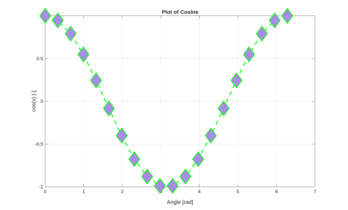
Putting it all together:
x = linspace(0, 2*pi, 20);
y = cos(x);
plot(x, y, 'LineWidth', 2, ...
           'Color', 'green', ...
           'LineStyle', '--', ...
           'Marker', 'diamond', ...
           'MarkerFaceColor', '#A98BEB', ...
           'MarkerSize', 20)

xlabel('Angle [rad]')
ylabel('cos(x) [-]')
title('Plot of Cosine')

grid('on')
When choosing colors for plots, there are two things to keep in mind. First, choose colors that will not fade or look similar if the plot is printed on a black and white printer. Two colors with the same brightness will be indistinguishable in black and white. The second thing to keep in mind is that 1 in 20 people are colorblind in some way. The default MATLAB color palette avoids color confusion. If you use custom colors, you can check if they would be confused by using online tools such as Coloring for Colorblindness.
The Specify Line and Marker Appearance in Plots in the MATLAB Help Center also covers all the plot style options.
Setting Axes
When you call plot(x,y), MATLAB automatically scales the axes of the plot to contain all the (x,y) coordinates.
It will also sometimes add some buffer around those limits so the tick marks on the axes are reasonable.
You can control the ranges on the x and y axes, the tick marks, and the labels for those tick marks to improve the plot.
With the previous examples plotting sine and cosine, for example, we should put the x-ticks at fractions of $\pi$, rather than at whole numbers of radians. The script below directly controls both axes of the plot:
x = linspace(0, 2*pi);
y1 = cos(x);
y2 = sin(x);

plot(x, y1)
hold on
plot(x, y2)
hold off

legend('cos(x)', 'sin(x)')
xlabel('x [rad]')
ylabel('f(x)')
title('Trigonometric Functions')

% Set the bounds on x and y axes
xlim([0, 2*pi])
ylim([-1.1, 1.1])

% Set the x ticks every pi/4 radians
xticks(0:pi/4:2*pi)
xticklabels({'0', '\pi/4', '\pi/2', '3\pi/4', '\pi', ...
             '5\pi/4', '3\pi/2', '7\pi/4', '2\pi'})

% Set the y ticks every 0.25
yticks(-1:0.25:1)

% Turn the grid on
grid('on')
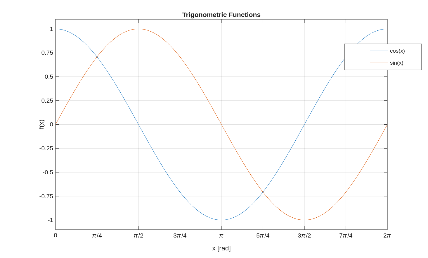
There is no need to set yticklabels in the example above.
Only use xticklabels and yticklabels if the standard output is not what you want.
The most common use for these are when x is a list of dates or times, and you want the tick labels to be formatted as such.
The MATLAB Help Center has documentation on xlim, ylim, xticks, yticks, xticklabels, and yticklabels.
Saving Plots
Once you have formatted the lines, labels, and axes of your plot, you will often want to save that plot as a file.
You can click File > Save or the Save icon in the window, then navigate to where you want to save it, give it a name,
and click save.
For one-off plots this is perfectly fine.
If you want to avoid all of that button clicking and tell MATLAB directly where to save the file,
there is the saveas command.
The two required inputes are the figure handle and the filename.
For most applications, the figure handle is the current figure or gcf which stands for get current figure.
The filename is the name of the image file you want to create.
For example:
plot(x, y)
saveas(gcf, 'my_plot.png')
Plots are most commonly saved as PNG files. The JPEG format is also available, but these look worse on screen than PNGs. You can also save plots as PDFs, which have the best quality but are sometimes harder to use. In general, saving figures as PNGs is the best option most of the time.
The MATLAB Help Center has documentation on saveas.
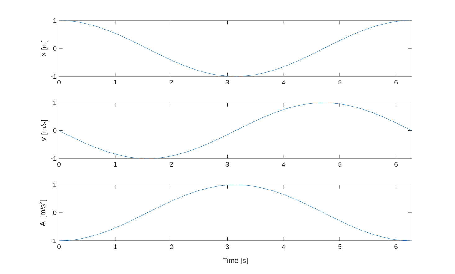
Subplots
Figures can contain multiple plots within the same window, known as subplots.
These can be useful for inspecting data that share the same x or y axes, but not both.
First use the tiledlayout function to define how many rows and columns of plots there are.
For 3 rows and 2 columns, use tiledlayout(3,2).
To select a subplot (or tile), use the nexttile command.
Tiles fill along the rows left-to-right, then top-to-bottom.
When you create a figure this way, in general zooming in on one plot does not affect the axes of the others.
If you want to keep the axes synced, use the linkaxes command like linkaxes([ax1, ax2], 'x') to link the x axes for example.
This is useful when inspecting multiple signals that vary with time.
If you zoom in to a narrower range in time, you would want all of the other plots to zoom to the same range.
For example:
t = linspace(0, 2*pi);
x = cos(t);
v = -sin(t);
a = -cos(t);

tiledlayout(3,1);

% Position
ax1 = nexttile;
plot(t, x)
ylabel('X [m]')

% Speed
ax2 = nexttile;
plot(t, v)
ylabel('V [m/s]')

% Acceleration
ax3 = nexttile;
plot(t, a)
xlabel('Time [s]')
ylabel('A [m/s^2]')

% Link axes
linkaxes([ax1, ax2, ax3], 'x')
The MATLAB Help Center has documentation on tiledlayout, nexttile, and linkaxes.
Special Plot Types
Logarithmic Plots
Logarithmic plots are used when data values span several orders of magnitude.
MATLAB includes three primary functions for logarithmic visualization.
The semilogx function applies a logarithmic scale to the x-axis, while semilogy applies it to the y-axis.
For plots requiring logarithmic scaling on both axes, use the loglog function.
These plots are particularly useful in the frequency domain, such as in acoustics, radio transmission, and control theory.
The MATLAB Help Center has documentation on semilogx, semilogy, and loglog.
Fill
The fill function generates filled polygons by specifying vectors of x and y coordinates.
For example, if x and y are the vertices of a polygon, then fill(x,y,'r') will plot that polygon in red.
The fill function can also accept RGB and hexidecimal, like plot.
You can also assign a unique color to each vertex and MATLAB will blend the colors and create an ombre effect.
Another input to fill is FaceAlpha, which allows you to set the transparency of the filled polygon.
The fill command is often used to specify keep-in or keep-out regions and to emphasize specific regions of a plot.
The MATLAB Help Center has documentation on fill.
Bar Chart
Bar charts can be used to represent data with discrete x values.
For example, if you have machines in a factory and want to plot the total downtime of each machine,
that could be represented with a bar chart.
With bar charts, it is especially important to use the xticklabels function to label the bars.
The MATLAB Help Center has documentation on bar.
Histogram
Histograms display the distribution of numerical data by dividing it into discrete intervals or “bins.”
These are especially useful for visualizing probabilistic quantities and statistical data.
To create a histogram in MATLAB, use the histogram function.
For example, histogram(x) will plot a histogram of the values of x.
To specify the number of bins for the histogram, use histogram(x, n).
You can also specify the edges of the histogram bins using histogram(x, edges).
While it may seem like histogram(x, n) or histogram(x, edges) require extra effort,
they can significantly influence conclusions drawn from the histogram if the number of samples in x is low.
With small samples, take care in setting up the bins of the histogram to avoid misinterpretation of the data.
The MATLAB Help Center has documentation on histogram.
Contour Plots
Contour plots are like terrain height maps, but for any 3D surface.
When height is a function of x and y, a contour plot shows curves of constant height.
This is especially useful for plotting functions of two variables.
The contour function is used like contour(x, y, z), where x is a vector of length m,
y is a vector of length n, and z is a matrix of size m x n.
The contourf function works the same way as contour, but it fills between the contour levels.
While contour plots are good for showing the general behavior of a function of two variables, they can be
difficult for reading specific values.
Imagine, for instance, if you received a PNG file with a contourf plot in it and you had to determine the z value for a specific (x,y) pair.
You would have to grab the color at those coordinates and compare it to the colorbar - a very inaccurate process.
Alternatively, the same data can be presented with plot, where you plot z vs x at multiple values of y ($z=f(x,y_{const.})$).
The MATLAB Help Center has documentation on contour and contourf.
Plotting on Maps
MATLAB includes several functions designed for visualizing data in geographical contexts.
The geoplot and geoscatter functions allow you to plot latitude and longitude coordinates on maps.
You can choose the map style/data using the geobasemap function.
These functions are very useful for plotting trajectories/ground tracks relative to features on Earth.
The MATLAB Help Center has documentation on
geoplot,
geoscatter, and
geobasemap.
Vector Fields
Vector fields, such as the magnetic field surrounding a magnet, can be plotted in MATLAB with the quiver function.
The general inputs to quiver are quiver(x, y, u, v), where x and y are arrays of the (x, y) coordinates of the tails of the vectors, u is the x-component, and v is the y-component.
The magnitudes of the plotted vectors are scaled, to an appropriate size for the plot.
Quiver plots can be useful for visualizing vector fields, aerodynamic flows, trajectories, and control signals.
The MATLAB Help Center has documentation on quiver.
Reading Questions
- Which two inputs are required by the
plotfunction? - What are 3 ways to customize the output of the
plotfunction? - Which command allows you to plot more than one line in a figure?
- How do you add labels to the axes of a figure?
- How do you add a legend to a plot and specify its location?
- How would you plot a dotted magenta line with square markers?
- What two factors should you consider when picking colors for plots?
- How would you save the current figure to the file “results.png”?
- How would you create a figure with a row of 4 subplots with linked y axes?