Plotting with Matplotlib
Matplotlib is a third-party library for creating plots, including line graphs, scatter plots, and many other chart types. It’s almost always used together with NumPy Arrays, since the values being plotted are usually the result of a numeric computation.
The Using Libraries page covers importing a library in general.
The plotting functions used in this course all come from matplotlib.pyplot, almost always imported under the alias plt.
The Matplotlib documentation has a Quick start guide.
Basic Line Plot
A minimal plot starts a new figure, plots y against x, and displays it:
import numpy as np
import matplotlib.pyplot as plt

x = np.linspace(0, 2 * np.pi, 100)
y = np.sin(x)

plt.figure()
plt.plot(x, y)
plt.xlabel("x")
plt.ylabel("sin(x)")
plt.title("Sine Wave")
plt.grid(True)
plt.show()
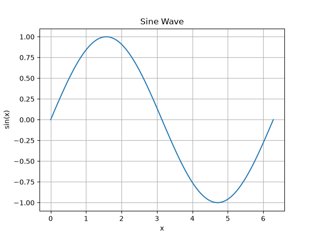
plt.figure() starts a new, blank figure.
Without it, a second plt.plot() call later in the same script would draw on top of the first figure instead of starting a new one.
plt.xlabel, plt.ylabel, and plt.title label the plot, and plt.grid(True) adds gridlines.
plt.show() displays the figure in a window.
Multiple Series and Legends
Calling plt.plot() more than once before plt.show() draws multiple lines on the same axes.
A label passed to each call, combined with plt.legend(), identifies which line is which:
import numpy as np
import matplotlib.pyplot as plt

t = np.linspace(0, 10, 50)
measured = 50 * np.sin(0.5 * t) + 100
predicted = 50 * np.sin(0.5 * t + 0.1) + 100

plt.figure()
plt.plot(t, measured, "b-", label="Measured")
plt.plot(t, predicted, "r--", label="Predicted")
plt.xlabel("Time (s)")
plt.ylabel("Altitude (m)")
plt.title("Measured vs. Predicted Altitude")
plt.legend()
plt.grid(True)
plt.show()
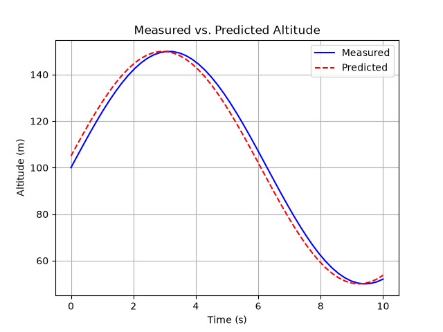
The third argument to plt.plot(), such as "b-" or "r--", is a format string that sets the line’s color and style in one short code: b and r for blue and red, - for a solid line and -- for dashed.
Scatter Plots
plt.scatter() plots individual points rather than a connected line, which is useful for marking specific values on top of a line plot:
import numpy as np
import matplotlib.pyplot as plt

t = np.linspace(0, 10, 50)
altitude = 1000 * np.sin(0.3 * t) + 2000
idx_peak = np.argmax(altitude)

plt.figure()
plt.plot(t, altitude, "k-", linewidth=2, label="Altitude")
plt.scatter(t[idx_peak], altitude[idx_peak], color="green", marker="o", s=80, label="Peak altitude")
plt.xlabel("Time (s)")
plt.ylabel("Altitude (m)")
plt.title("Altitude Profile with Peak Marked")
plt.legend()
plt.grid(True)
plt.show()
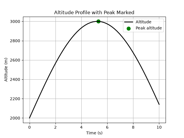
np.argmax(altitude) finds the index of the largest value in altitude, which is then used to pull the matching t and altitude values for the scatter point.
Bar Charts
plt.bar() plots a value per category, rather than a value per point along a continuous axis, which suits data like a list of part masses better than a line plot:
import matplotlib.pyplot as plt

parts = ["booster", "second stage", "fairing"]
part_masses = [25000, 4500, 1900]

plt.figure()
plt.bar(parts, part_masses)
plt.ylabel("Mass (kg)")
plt.title("Part Masses")
plt.show()
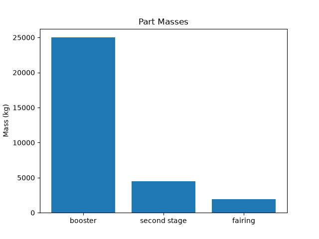
The first argument to plt.bar() is the list of category labels, and the second is the list of values, one per category.
Histograms
plt.hist() shows how a set of numeric values is distributed, by grouping them into bins and plotting the count in each bin:
import numpy as np
import matplotlib.pyplot as plt

np.random.seed(0)
sample_readings = np.random.normal(loc=9.81, scale=0.03, size=200)

plt.figure()
plt.hist(sample_readings, bins=20)
plt.xlabel("Gravity reading (m/s^2)")
plt.ylabel("Count")
plt.title("Distribution of Simulated Gravity Readings")
plt.show()
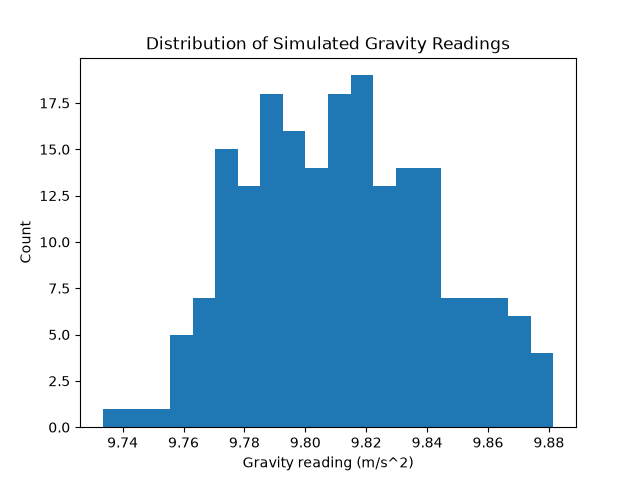
bins=20 splits the data’s range into 20 equal-width intervals.
Increasing the number of bins shows finer detail in the distribution’s shape, at the cost of a noisier-looking chart.
Saving a Figure
plt.savefig() writes the current figure to an image file instead of (or in addition to) displaying it in a window:
plt.plot(x, y)
plt.savefig("my_plot.png")
PNG is the most common format for saving a plot. Matplotlib also supports PDF and other formats based on the file extension given.
The Matplotlib documentation has reference pages for plot, scatter, bar, hist, and savefig.
Reading Questions
- What does
plt.figure()do, and what happens if you plot twice without calling it a second time? - How do you add a legend to a plot with multiple lines?
- What does the format string
"r--"specify about a line? - What is the difference between
plt.plot()andplt.scatter()? - When would a bar chart be a better choice than a line plot?
- What does increasing the number of bins in
plt.hist()do to the resulting chart? - How would you save the current figure to a file named
results.png?